

What Happens When You Give a Pirate a Face Lift.
Why customers revolt when companies like Cracker Barrel, Spotify and Coca-Cola mess with the brands people thought they shared.
I was reading a Fast Company article about Pirate’s Booty, the puffed rice-and-corn snack with the wonderfully ridiculous name, and its new rebrand. It reminded me that marketers never seem to learn one basic lesson: a successful brand can become sacred to the people who buy it. Maybe there were too many young mateys in the brand meeting and not enough weathered pirates who knew which treasure not to bury.
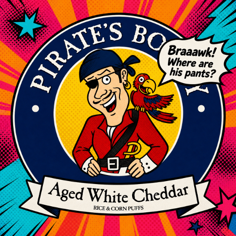
Pirate’s Booty, now part of The Hershey Co., was created in 1987 by entrepreneur Robert Ehrlich as a healthier alternative to other kids’ snacks. It’s one of those brands whose charm has always lived partly in its own silliness. It is a cheesy puffed snack with a pirate, a treasure-chest and a name that sounds as if it was approved by a seven-year-old.
The original pirate had an expression that seemed to say, “Hi! I’m not wearing pants,” while the parrot had an expression that seemed to say, “Hi! He’s definitely not wearing pants.” That was part of the charm. Nobody was looking to Pirate’s Booty for maritime trouser compliance.
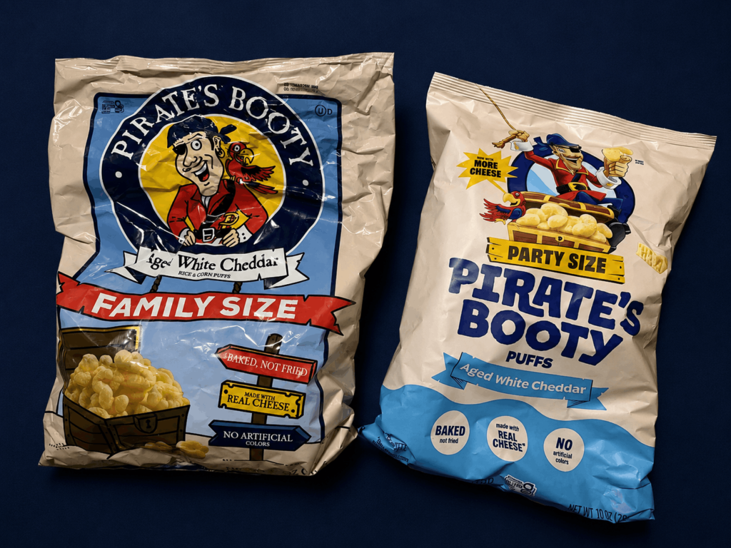
Now the artwork has moved from a flatter, more hand-drawn 2D style to a more dimensional, animated-looking 3D world. Yes, the new pirate is clearly wearing pants, in case you were wondering. But what I really want to know is why no one is talking about the fact that his eye patch appears to have changed sides? To me, that should be the major controversy. This poor man has somehow suffered the misfortune of gaining eyesight back in one eye while losing it in the other. Or worse, maybe he never had an eye problem in the first place, and the brand has been living with this lie all along.
My point is that the old packaging had a scruffy, lunchbox, treasure-map quality. The pirate felt like he belonged on a snack bag, not on a brand strategy slide. Then came the redesign: cleaner, smoother, neater, more modern, more polished and more professionally behaved. In other words, exactly the sort of thing that can sometimes make a brand worse while making every individual element look “better.”
When Better Looks Worse
This is where many companies get into trouble. They confuse modernization with cosmetic surgery. They take something familiar, loved and a little odd, send it away for expensive work, then act surprised when it comes back looking younger, tighter and somehow less itself.
A bad rebrand is a lot like the backlash a beloved actress gets after a nip and tuck. The public reaction is rarely, “What marvelous structural refinement.” It’s usually, “What happened to her?” That’s because people don’t fall in love with symmetry. They fall in love with expression, character and familiarity.
Brands work the same way. You can simplify a logo, polish a mascot, update the packaging, refine the colors and improve every visible element, yet still damage the thing people actually liked. The brand comes back from surgery looking more contemporary, but less familiar. Customers notice, even if they don’t describe it in the language of brand equity. They never say, “You damaged a distinctive memory structure.” They say something much more useful: “Why did you ruin it?”
The Customer Owns the Feeling
Marketers should listen to that, because a successful brand is the love child of a company and a customer. The company creates the name, logo, package, mascot, color palette, tone and promise. But customers add the memory. They add the recognition, ritual, habit, trust, nostalgia, loyalty and emotional meaning. The company may own the trademark, but the customer owns the feeling.
That’s why changing a brand isn’t just a design decision. Its relationship surgery. And when companies operate without understanding what customers are emotionally attached to, they shouldn’t be shocked when the patient wakes up angry.
Inside companies, familiar brand assets often start to feel tired. The brand team has seen the logo too many times. The agency wants to make its mark. The new CMO wants proof of momentum. The board wants modernization. Someone says the current identity is not “digital-first,” and before anyone can say “distinctive assets,” a beloved mascot is being quietly made to walk the plank.
But customers aren’t in those meetings. They’re not tired of the brand in the same way the brand team is tired of the brand. They see it for a few seconds on a shelf, sign, app icon, aircraft tail, streaming screen or restaurant wall. Familiarity is not boredom to them. Familiarity is usefulness. This is where companies get dangerously stupid. They look at a familiar symbol and see age. Customers look at the same symbol and see home.
Clean Can Become Empty
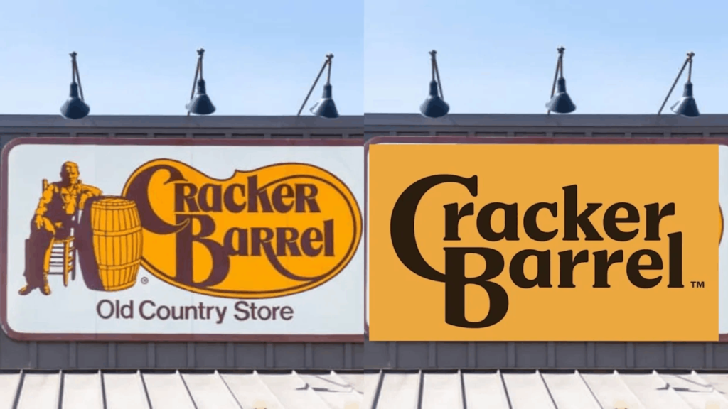
Cracker Barrel learned that lesson the hard way. When the company removed the familiar old man from its logo, it may have thought it was simplifying. Many customers saw something else. They saw a brand removing one of the cues that made it feel like Cracker Barrel.
The old man wasn’t elegant. He wasn’t sleek. Exactly. He was rocking chairs, biscuits, road trips, country-store clutter, fake old-timey comfort and the promise that nothing inside would be too surprising. He wasn’t decoration. He was a shortcut to the whole experience.
The backlash became political, cultural and emotional almost immediately, but underneath the noise was a very simple marketing lesson. Customers had decided that the old man belonged to the brand. When the company removed him, customers behaved as if something had been taken from them. Eventually, the company reversed course. That is the thing about brand symbols: from the inside they often look decorative, but from the outside they may be foundational.
Recognition Is Not Decoration
The same mistake can happen with packaging. Tropicana famously replaced its familiar orange-with-a-straw image with a cleaner, more premium-looking carton. In a design presentation, it probably looked fresh. On a supermarket shelf, it became harder to find. The orange wasn’t just a picture. It was a shopping shortcut. It said, “Here I am. I am the one you already know and love” When Tropicana removed it, the brand didn’t simply lose a visual device. It damaged recognition at the exact moment recognition mattered most.
This is why distinctive brand assets matter so much. Logos, colors, mascots, slogans, package shapes and product cues are not merely aesthetic choices. They are commercial infrastructure. They help people recognize, choose and trust a brand without having to think too much about it. One study of brand codes found that only about 15% of tested assets were truly distinctive. That should terrify marketers. If your brand is lucky enough to own something people recognize, why casually sand it down until it looks like everything else?
The lesson isn’t that old is always better. Sometimes old is just old. Sometimes a logo really does need to be improved, a package really does need to be simplified, and a brand really does need to evolve. But there is a difference between removing clutter and removing character. There is a difference between modernizing a brand and making it anonymous.
The Meaning Test Beats the Taste Test
Coca-Cola learned an even bigger version of this lesson all those years ago with New Coke. The company thought it had a product problem. Pepsi was winning taste-test battles. A sweeter formula tested well. So, Coca-Cola changed the formula. On paper, it was rational. In real life, it was madness.
People weren’t just drinking a fizzy brown liquid. They were drinking memory, Americana, habit, family refrigerators, gas stations, ballgames and one of the most loaded pieces of commercial symbolism on earth. Coca-Cola won the taste test and lost the meaning test.
That’s one of the great traps in research. (There’s more than one, but don’t get me started!) It can tell you what people prefer in isolation, but not always what they are emotionally unwilling to lose. When testing a rebrand, companies should not only ask which design looks better. They should ask which design still feels like us, what customers would miss if it disappeared, what people will think we are trying to say, and what meaning we may be accidentally killing.
Even Temporary Changes Touch Memory
Poor Spotify. Its temporary 20th-anniversary app icon was glittery and disco-ball-like. It was not meant to be permanent. It was a campaign flourish. But plenty of users hated it anyway and wanted the familiar green icon back.
That reaction matters precisely because the change was temporary. If people can get irritated by a short-lived icon change, imagine what happens when a company permanently removes a symbol customers use every day to find, trust or emotionally decode a brand.
Global Brands Still Need Roots
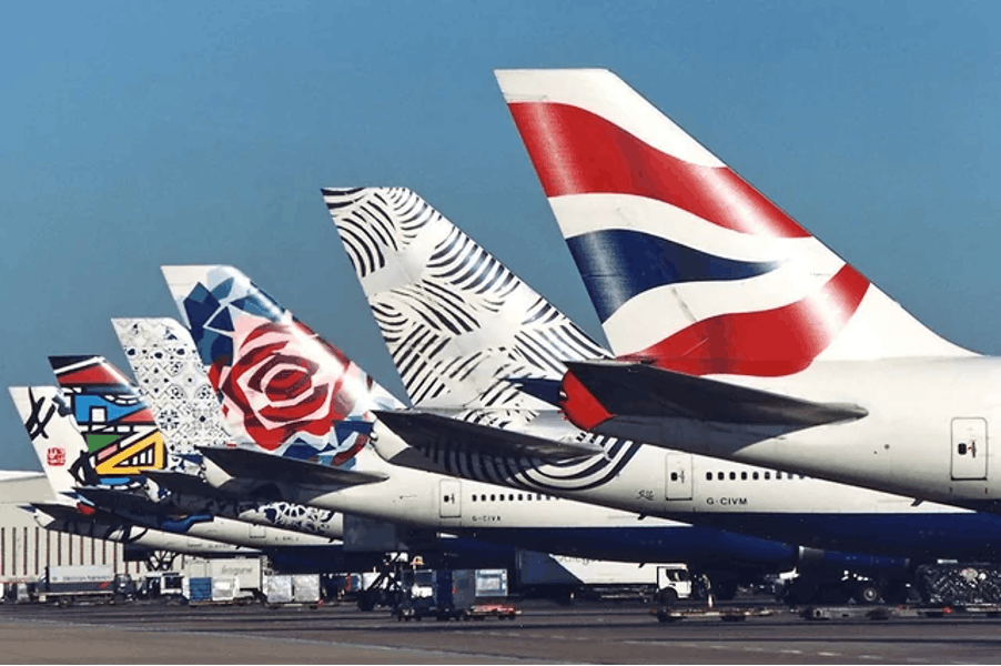
British Airways once tried to replace its Union Flag-style tailfins with more international “World Tails” designs. Strategically, the logic was understandable. Airlines are global. Customers are global. Britain itself was changing. The company wanted to look more cosmopolitan. But many customers and critics saw a British airline removing one of the clearest visual signs of Britishness from its aircraft. The lesson isn’t that national symbols are always sacred. The lesson is that rootedness matters. A global brand doesn’t become more global by becoming less itself.
The Backlash Is Now Part of the Launch
The stakes are higher now because trust has become more personal and backlash has become more immediate. Roughly 80% of people say they trust brands they personally use. That’s not abstract corporate goodwill. That’s intimate, practical trust. It’s the trust of “I know this,” “I buy this,” “this has never disappointed me,” “my family uses this,” and “this is part of my life.” So, when a company changes familiar brand symbols, customers can experience it as more than a visual update. The company thinks it changed a logo. The customer thinks it changed the deal.
What’s more, a rebrand no longer launches quietly. Screenshots spread instantly. Critics pounce. Customers mock. AI search summarizes the outrage. Investors notice. Employees cringe. The launch video with the earnest voiceover suddenly looks like evidence at a trial. A rebrand is no longer a controlled announcement. It is an open audition for public ridicule.
The Real Sin Is Disrespect
None of this means brands should never change. Of course they should change. Markets change. Customers change. Channels change. Technology changes. Taste changes. A brand that never evolves eventually becomes a museum piece with a sales target. But smart change makes a brand more itself. Bad change makes a brand more generic. Bad change behaves as if the trademark certificate is the whole relationship.
That’s the arrogance at the heart of so many failed rebrands: believing that because the company owns the mark, it owns the relationship. A successful brand is the love child of a company and a customer. And nobody likes watching one parent give the child a facelift without permission.
What Marketers Should Learn
Before changing a familiar brand asset, marketers should ask what job it actually does. Does it help people recognize you faster? Does it signal trust? Does it carry heritage? Does it make you distinctive? Does it create affection? Does it make customers feel that you are still the brand they chose? If the answer is yes, treat it carefully.
Don’t start with what the brand team is tired of. Start with what customers would miss. Don’t mistake a cleaner logo for a stronger brand. Don’t assume “digital-first” means “personality-last.” Don’t let the strategy deck murder the mascot. And above all, don’t surgically remove the weird little thing people love just because it looks old in a conference room.
Maybe Pirate’s Booty will be fine. Maybe the new pirate will settle in. Maybe kids won’t care. But this lesson is bigger than one pantsless, eyepatch swapping pirate.
When customers love a brand, they don’t only love the product. They love the accumulated meaning around it: the oddness, the shortcuts, the signs, the rituals and the emotional furniture. Change those things carelessly and people may react as if something has been stolen from them. Because, in a way, it has.
Sources: Fast Company — Pirate’s Booty rebrand and packaging update, Reuters — Cracker Barrel logo reversal after backlash, Ipsos / Jones Knowles Ritchie — Distinctive brand assets research, Edelman — 2025 Brand Trust report.

