


Marketing Research: What’s Real, What’s Garbage–a Refresher for Marketers
Many brands turn to surveys and focus groups hoping for a glimpse into the future, treating research like an infallible crystal ball that can validate their marketing decisions. But research isn’t magic, and it’s far from foolproof. From misleading percentages to meaningless sample sizes, marketers constantly misuse data—often without even realizing it. This guide breaks down how to read research properly, avoid common statistical traps, and stop making decisions based on numbers that don’t actually mean anything.
British Prime Minister Benjamin Disraeli apparently once said: “There are three kinds of lies: lies, damned lies, and statistics.” And I don’t disagree with ol’ Ben.
Numbers, as trustworthy as they seem, can be twisted, cherry-picked, and misrepresented until they say whatever you want them to say. And if you think you’re too savvy to be hoodwinked, there’s a bridge I’d like to sell you.
I’m not saying most people deliberately mislead with statistics. I’m saying research is, at best, flawed—and at worst, manipulated, whether by design or incompetence, to serve an agenda. It’s flawed because the act of asking questions alters responses (the Hawthorne Effect), sample sizes are often too small, or questions are framed to skew results. It’s manipulated when data is presented as fact, but shaped to tell a convenient fiction.
The COVID-19 pandemic was a goldmine for bad predictions. Early in the crisis, research firms confidently declared that remote work would permanently replace office culture, that people would stop dining out, and that retail was dead. Fast forward a few years, and many office buildings are full, restaurants have waitlists, and retail is thriving. It turns out that asking people what they think they’ll do in the future is wildly unreliable.
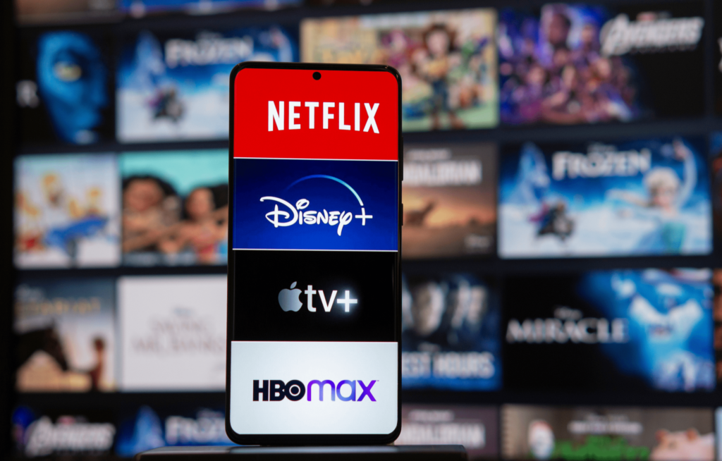
Then there’s the streaming industry, which completely misread subscriber loyalty. Netflix, Disney+, and HBO Max all assumed their research showed that customers would tolerate price hikes. Instead, millions of users canceled their subscriptions. People say they’ll stay, but when their credit card gets charged, reality kicks in.
Political polling is another prime example of research gone wrong. The last U.S. presidential election was yet another reminder that pollsters can get it horribly wrong—again. Pre-election numbers confidently predicted one outcome, only for election night to tell a different story. The same thing happened in the UK, where polls repeatedly underestimated Conservative Party support. Why? The same reasons marketing research fails: bad sampling, self-selection bias, misleading questions, and overconfidence in small differences. I only bring this up because if the top US pollsters—armed with decades of experience and millions in funding—can still botch an election forecast, do you really think your brand’s toothpaste survey is airtight?
So, given my skepticism, why am I writing an article about how marketers should use statistics correctly? Because too many rely on research without really understanding how stats work—and if you’re going to use them, you should at least use them right.
What Research Can (and Can’t) Do for Marketers
Research can be useful for spotting broad trends over time. If your customer satisfaction score has been dropping steadily for two years, that’s a real trend worth investigating. But if it dipped by 3% last month, don’t panic—it’s probably just noise. It’s also great for tracking shifts in behavior over time. If your brand was beloved in 2022 but is now struggling, research can help pinpoint when and why perceptions started to change.
It’s also a somewhat useful tool for generating hypotheses—showing you what’s worth investigating, rather than dictating your next move. If data suggests Gen Z is spending more on skincare, it’s worth exploring, but it doesn’t mean you should launch a moisturizer tomorrow.
That brings us to an important distinction: research is best for testing messaging, not ideas. Many of the best marketing ideas would have been murdered in a focus group. However, if research shows that people respond more positively to the word “premium” than “luxury,” that’s a useful insight you can apply without gutting a creative concept.
The real problem starts when marketers misuse research, expecting it to serve as a crystal ball. People are notoriously unreliable when predicting their future behavior. Ask them if they plan to go to the gym three times a week next year, and most will say yes. Check back in February, and their gym card is collecting dust.
Another major misuse of research is using it to justify a bad decision after the fact. If you’re cherry-picking data to validate a choice you already made, you’re not doing research—you’re doing PR. The worst offenders, however, are those who let research replace instinct and creativity altogether. No survey would have led to Tesla ditching traditional advertising altogether, and no focus group would have approved Ryanair’s counterintuitive, unfiltered (and very popular) strategy of openly mocking its own customers on social media. Some of the greatest marketing decisions have gone against the data.
How Research Gets Misused: Common Mistakes and How to Spot Them
If you’re going to use research, you’d better know how to conduct and analyze it properly. Here are a few things to know to make your research more useful and some of the most common (and most dangerous) pitfalls to watch out for.
1. The More Agreement, the More Reliability
If you conduct a survey and nearly everyone agrees on something, congratulations—you might actually have a reliable result. The Law of Large Numbers tells us that as a sample size grows, the average of the collected data gets closer to the true average of the population. In plain English, if you survey enough people and they overwhelmingly agree, you’re probably onto something. But if the responses are all over the place, your data is about as reliable as a drunk guy guessing lottery numbers. That’s why a survey where 90% of respondents agree on something is far more useful than one where opinions are scattered.
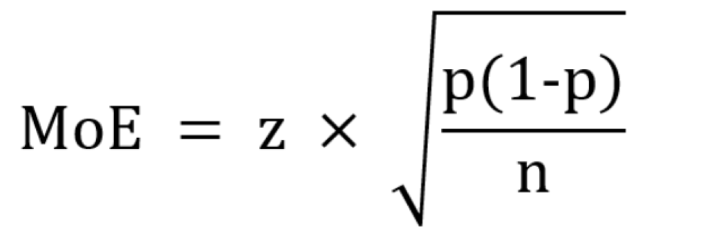
2. The Magic Number for Any Universe: 1,067
Bigger sample sizes don’t always mean better accuracy. Shouldn’t you survey millions of people for the best results? Not really. The magic number you need is 1,067. Why this oddly specific number? Because 1,067 respondents give you a ±3% margin of error at a 95% confidence level, no matter how big the total population is. Whether you’re surveying an entire country or everyone who’s ever rage-tweeted about airline delays, you don’t need millions of responses—just the right 1,067. For reference: 500 respondents = ±4.5% margin of error (less precise). 10,000 respondents = ±1% margin of error (more precise but with diminishing returns). This is why 1,067 is the sweet spot—big enough for accuracy, small enough to avoid lighting your research budget on fire. Of course, the sample has to be representative in terms of gender, age, etc.
By now your eyes may be glazing over. But if you’re interested, here is the formula for margin of error.
3. The Great Data Slice-and-Dice Disaster
Breaking data into smaller subgroups is like slicing a cake—you start with a full, delicious picture, but the more pieces you cut, the smaller and less satisfying each bite becomes
A UAE-wide survey of 1,067 people gives you a reliable ±3% margin of error. But after you conduct that survey, if you break it down by each emirate, suddenly your sample sizes shrink along with its reliability. If Dubai accounts for 40% of respondents, that’s only 427 people, pushing the margin of error closer to ±5%. Adu Dhabi, with 15% of respondents, now has just 160 people, sending the margin of error past ±8%. Keep slicing further—say, by age, gender, or left-handedness (because why not?)—and suddenly, your data is less science, more astrology. The smaller and more obscure the sample, the shakier the conclusion.
4. The Oven-and-Ice Problem: Why Percentages Can Lie
One of the worst offenses in marketing research is playing fast and loose with percentages
There’s an old joke about a statistician who has his head in an oven and his feet in ice, yet insists that, on average, he feels fine. This is exactly how marketers present data—averaging wildly different numbers and pretending they tell a coherent story. If a survey claims “30% of users clicked our ad,” the obvious first question should always be: 30% of what? Five people out of 15? 3,000 out of 10,000? A percentage without raw numbers is meaningless. A company might say its conversion rate jumped 50%, but if that just means it went from two customers to three, that’s not exactly cause for celebration.
5. Margin of Error: Why Tiny Differences Don’t Matter
Marketers love obsessing over small shifts in numbers, but if the change is within the margin of error, it’s not a real change—it’s noise. If a survey finds that “37% of customers prefer Brand X (±3%)”, that means the real number could be anywhere from 34% to 40%. If you’re making decisions based on a 1% or 2% difference when your margin of error is ±3%, congratulations—you’re reading statistical tea leaves. If the margin of error is bigger than the difference, your conclusion is built on statistical quicksand.
6. Sampling Error: Why Small Changes Can Be Misleading
Even if you follow all the rules, research isn’t perfect. If you run a survey today and repeat it with a different (but equally structured) group tomorrow, you’ll still get slightly different results. That’s called sampling error, and it’s why minor shifts in survey data shouldn’t send you into a panic. Marketers often freak out over tiny dips in survey numbers. If customer satisfaction was at 82% last quarter and dropped to 80% this quarter, is that a real issue? Not necessarily. It could just be noise in the data. Instead of obsessing over minor fluctuations, watch for trends over time. A slow, steady decline? That’s a red flag. A one-time 2% drop? Probably not worth losing sleep over.
7. The Danger of Self-Selection Bias
If you let people choose whether to participate in a survey, congratulations—you’ve just created biased data. People who willingly take surveys are not a random cross-section of the population. They’re typically: 1. Extremely happy 2. Extremely angry 3. Extremely bored. This is why online reviews are terrible for accurate research. The neutral majority? They don’t bother. The same thing happens with political polling. Certain voter groups are less likely to respond, skewing results. This is why pollsters have been embarrassingly wrong in multiple elections. I mean, ask yourself this: who answers a call from an unknown number these days?
8. The Perils of Leading Questions and Confirmation Bias
“Wouldn’t you agree that our product is revolutionary?” That’s not research. That’s manipulation. Leading questions push respondents toward a particular answer, whether they realize it or not. It’s one of the easiest ways to ruin a survey, and marketers do it all the time. Then there’s confirmation bias, where marketers interpret data in ways that support what they already believe. If you want to prove that customers love your product, you’ll find data that supports it—ignoring the parts that don’t. Good research asks neutral questions and accepts results—even when they aren’t what you want.
9. Statistical Significance vs. Practical Significance
Just because a result is statistically significant doesn’t mean it’s useful. Marketers often get excited about a tiny percentage difference and assume it means something important. Imagine a brand tests two ad headlines, and Headline A gets 51% engagement while Headline B gets 49%. Statistically, that might be significant. But does a 2% difference justify an entire campaign overhaul? Probably not. Statistical significance simply means the result isn’t random—not that it’s meaningful. The better question is: Does this difference actually matter for business? If not, move on.
10. Correlation vs. Causation: The Oldest Statistical Sin
Just because two numbers move together doesn’t mean one causes the other. Ice cream sales and drowning deaths both rise in summer, but no one’s blaming the Rocky Road. Marketers fall for this all the time. A study may find that people who drink coffee are more successful, but does that mean coffee creates success? Or are ambitious, hardworking people just more likely to need caffeine? Any claim that “X causes Y” should immediately raise red flags. If the data doesn’t prove direct causation, assume someone’s trying to make a weak argument sound impressive.
How to Not Get Tricked by Bad Stats
Use research to spot trends, not predict the future. Never base big decisions on tiny differences. Always check sample size and margin of error. Be skeptical of overly specific breakdowns. Correlation is not causation. If the numbers look weird, they probably are. And just remember: 87.5% of all statistics are made up. Including that one.

